



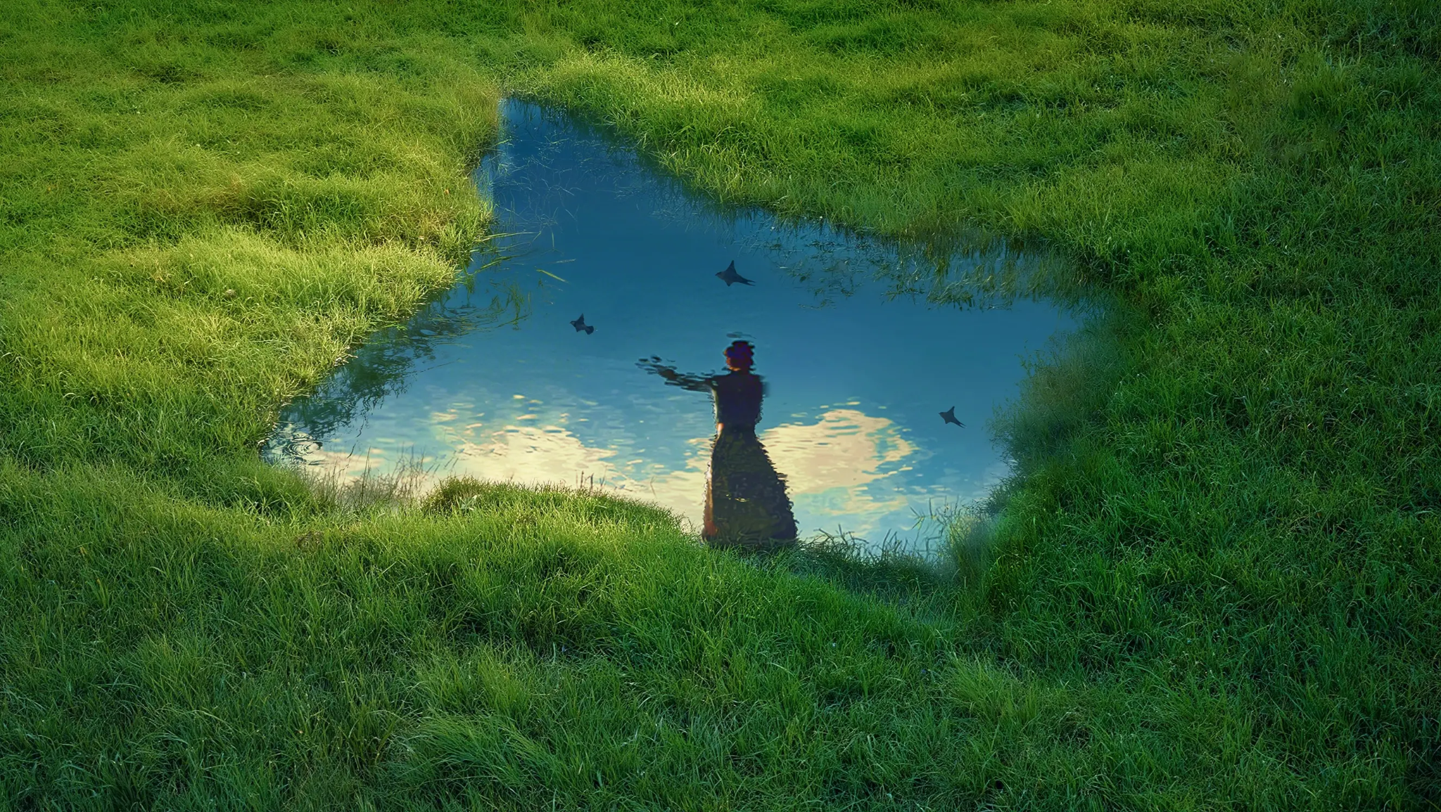
A useful blog image does more than fill an empty space. It can introduce the subject, make a step easier to understand or give readers a clearer sense of the situation described in the article. A free online ai image generator such as Dreamina can help creators explore illustrations and visual concepts when a suitable photograph is not available.
The important decision comes before generating: what should each image contribute to the article? This guide follows a fictional blog post about building a simple morning routine, from planning its cover image to preparing supporting visuals for publication.
Read the article and identify what someone came to learn. A cover image should give a quick sense of the subject; an image within the article should support the section beside it. Those two jobs may call for different compositions.
Imagine a blog post titled “How to Build a Morning Routine That Works for You.” Its reader wants practical ideas for organising the start of the day, not a perfect-looking lifestyle to copy. The article covers three steps: preparing the night before, choosing a realistic first activity and adjusting the routine over time.
A useful cover could show a calm morning setting with a notebook, a glass of water and natural light. A supporting image might show a short evening preparation scene, such as a person laying out clothes or writing a note for the next day. The images support different parts of the article rather than repeating the same cup of coffee in every section.
Write a one-sentence purpose for each planned image: “Introduce the theme of a flexible morning routine” or “Help readers picture a small preparation step.” If you cannot explain how an image helps the section, you may not need it.
Decide which images the article actually needs
A long article does not automatically need an image beneath every heading. Too many similar visuals can interrupt the reading experience without adding information.
For the fictional routine article, a simple image plan could be:
Cover image: introduce the overall theme with a realistic morning setting.
Section image: show one example of preparing the night before.
Optional supporting graphic: summarise the three steps if readers would benefit from seeing them together.
The first two may work as illustrative images. The third could be clearer as an editable graphic made in a design tool, especially if it contains exact labels or an ordered sequence. Choose the format that helps the reader understand the information.
Consider whether a real photograph, screenshot or diagram is more useful. A tutorial explaining a specific app may need an actual screenshot; an article comparing measurements may need a labelled chart. A generated lifestyle scene can create context, but it cannot demonstrate an exact interface or establish a factual measurement.
Build a short visual brief
A visual brief turns the article’s topic and audience into directions for an image. It can be a few lines rather than a formal document.
For the morning-routine article:
Purpose: Introduce an approachable, flexible start to the day.
Subject: A notebook and glass of water on a small table by a window.
Mood: Calm, practical and lived-in.
Style: Natural editorial photography with soft morning light.
Composition: A wide frame with the main subject to one side and quiet space for an optional headline.
Avoid: Invented logos, text and exaggerated luxury details.
This brief makes it easier to judge the output. If the image looks like an expensive hotel suite, it may be visually attractive but less appropriate for an article about building a routine within everyday constraints.
You can also note the images’ intended relationship. A consistent palette or lighting style helps them feel like part of the same article, but the cover and section image should still show different ideas.
Write a prompt for the cover image
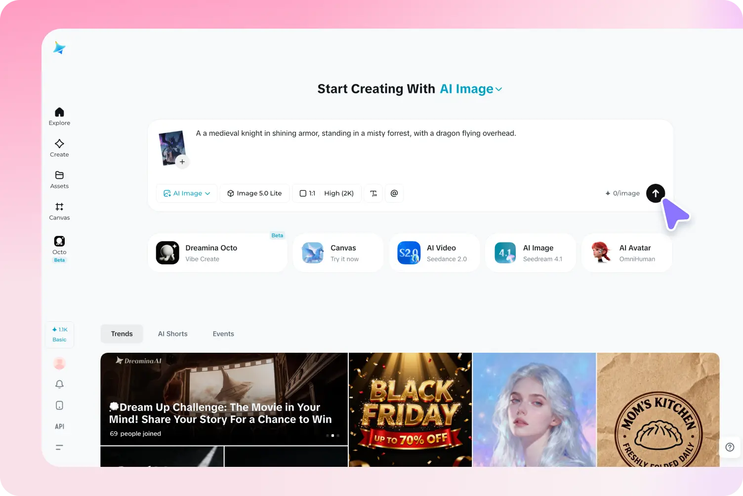
A useful prompt describes the subject, setting, visual style, light and composition. It should also say where any space for text needs to remain.
Example cover prompt: “Natural editorial photograph of a simple morning setting: a notebook, a glass of water and a folded cardigan on a small wooden table beside a window. Soft early daylight, warm neutral colours, calm and lived-in atmosphere. Wide composition with the objects on the right and a quiet area on the left for an optional headline. No text or logos.”
The prompt gives the generator a scene and a visual purpose. It does not need to describe every paragraph of the article. If the blog template places the title above the image rather than over it, the empty space can instead allow the composition to breathe.
Choose an aspect ratio that suits the blog’s actual layout when the selected workflow offers that setting. A common wide shape may be a useful starting point for a cover, but confirm how the website displays the image on desktop and mobile. A prompt saying “wide” does not necessarily set the output dimensions.
After generating, ask: does this image suggest the article’s topic without implying that everyone needs the same routine? Is the focal point clear at a small size? Would the image still make sense if the crop removed part of the background?
Create a supporting image for a specific section
A section image should do a different job from the cover. For the step about preparing the night before, show a recognisable action rather than another generic morning still life.
Example section prompt: “Natural editorial illustration of an adult preparing for the next morning: placing a notebook and a set of keys on a small table in a modest home. Soft evening lamp light, warm neutral palette, calm and practical atmosphere. Show the hands and objects clearly, with an uncluttered background. No text or logos.”
This image introduces a small action mentioned in the article. The evening light distinguishes it from the cover while the warm palette connects the two.
If the generated hands or objects look confusing, simplify the scene. A photograph-like image of the notebook and keys already arranged on the table may communicate the idea more clearly than a complicated hand movement. Compare the result with the sentence it will sit beside: if the visual suggests a different activity, revise the prompt or choose another image.
Show the useful detail, not every detail. A supporting image can illustrate an example, but it should not be presented as proof that a particular routine produces a health outcome. Claims in the text need appropriate supporting sources.
Add a graphic when precision matters
Some blog content needs an exact relationship between words, numbers or steps. AI-generated visual concepts can inspire the look, but a graphic with editable labels is often easier to check and update.
For the routine article, you could make a simple three-step graphic: “Prepare,” “Choose one action,” and “Adjust over time.” Create the layout in an editor using verified wording and enough contrast for the text to remain readable. Add a short explanation in the article so readers do not have to rely on the image alone.
For a chart, use accurate underlying data and a suitable charting tool. Do not use generated bars, percentages or labels as evidence without rebuilding and checking them against the source. A realistic-looking illustration of a graph is not the same as a correct data visualisation.
This distinction is useful when deciding what to generate: use an illustrative scene to support a concept, and use editable text, diagrams or real screenshots when the reader needs precise information.
Match the image to the blog layout
A cover image and an in-article image can have different dimensions. Check the content management system or theme before exporting, including how it crops the cover on an article page, listing page or mobile screen.
Keep the important subject away from the extreme edges when the layout may crop the image. For the cover, the notebook should remain visible even if the site trims part of the left or right side. Test the actual theme rather than assuming that a particular ratio will work everywhere.
Within the article, choose a size that lets the image support the text without forcing readers to scroll through an unnecessarily large visual. If the site displays a smaller thumbnail that opens a larger image, check both views.
Do not stretch an image to fill a differently shaped frame. Preserve its proportions, crop intentionally or prepare a separate composition. A square social share image may need a different crop or a new image rather than a distorted version of the blog cover.
If you need a real product, place or person to look exact, use approved source material and verify the final result. An AI-generated image can change small details even when the prompt asks it to keep them consistent.
Improve weak results with targeted changes
If the first image is attractive but feels unrelated to the article, return to its purpose. Does it show an actual activity or idea from the section? If not, replace a generic subject with something the reader can recognise from the text.
If the image feels too staged, describe a more realistic setting: “a small table in an ordinary home” may be more useful than adding adjectives such as “authentic” or “relatable.” If it is too cluttered for a cover, reduce the number of objects or specify which area should remain clear.
If the image does not match the article’s tone, adjust the lighting and style. A brightly coloured cartoon might work for a playful beginner guide but feel out of place in a restrained editorial article. Keep the changes specific enough to compare: soft window light, fewer props or a tighter view.
If generated text is misspelled, remove it from the prompt and add the words separately. If hands, product labels or small objects look inconsistent, simplify the visual, use a clearer reference or select a different draft.
Change one or two things at a time and keep a record of the prompt and selected result. This helps you understand which revision made the image more useful.
Prepare the image for publication
Before uploading, choose a descriptive filename that reflects the image itself, such as “notebook-keys-evening-preparation.jpg.” A clear filename helps with organisation and can provide contextual information, but it is not a substitute for a useful image or a guarantee of search visibility.
Export in a format appropriate for the site and check the final image quality. Compress the file enough to support reasonable page loading while keeping the subject clear. The right settings depend on the image, website and tools available; preview the actual export rather than judging only the original.
Write alternative text based on the image’s purpose and context. For the supporting image, useful alt text might be: “A notebook and keys arranged on a table for the next morning.” If the image is purely decorative and adds no information beyond nearby text, an empty alt attribute may be appropriate, depending on how the site uses it.
Avoid stuffing keywords into alt text. Describe relevant visual information for someone who cannot see the image, and make sure the surrounding article explains any information essential to understanding the topic.
Check the complete article before publishing
Preview the article as a reader would: scan the title and cover, read the section where each image appears and view the page on a phone. Ask whether each visual fits the nearby content and whether the page still works when images are not visible.
Check permissions for reference materials and any other assets, and follow the applicable terms for the tools and images you use. When a visual depicts a real person, product or location, confirm that it does not create a misleading impression.